we have a bit of an interest in flag design that we indulge in every now and then, and figured we'd make a page to share some designs of ours. we'll likely come back and add to this page every now and then whenever we make another that we kinda like and wanna share :3 you can click on the flags to get a larger-size png of them, or click the link below them to get the original svg!
Personal Flag (2024-2026)



this was a design we originally threw together in a day in 2024 to represent ourselves, after seeing some other friends do the same. there isn't loads of explicit symbolism to it as there is more just general vibes to the design:
- the heart is teal, our favorite color, under an umbrella, a symbol we use for a couple things and that implicitly represents rain
- the six stripes were originally intended to be colored like ice cream or baked goods (from top to bottom, being pumpkin pie, vanilla, strawberry, mint, blue moon, and berry), and also act as pastel alternatives to the personal colors of the six members of our system
- the ratio is long and the stripes taper off because we like when flags aren't basic 2:3 rectangles
- like on our earlier Pluto flag, the heart and umbrella are tilted 17.16 degrees, both to subtly reference our favorite planet in the same way, and because 17 is our favorite number
we also have two earlier iterations of this flag: the original we made in 2024 with four stripes, and the second version we made in 2025 with a fifth stripe after ade first fronted. in both of these the intent of the stripes was to directly represent ice cream flavors as a nod to the feedism flag, but while updating it after halo first fronted we figured it made more sense to use the colors we already use for ourselves :3
Flag of a place (2025)
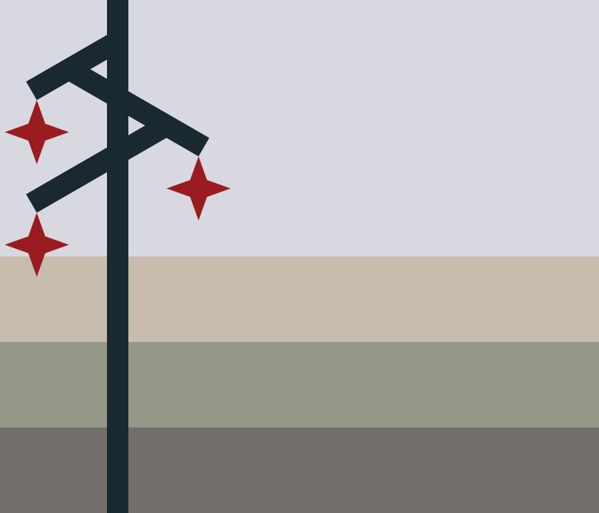
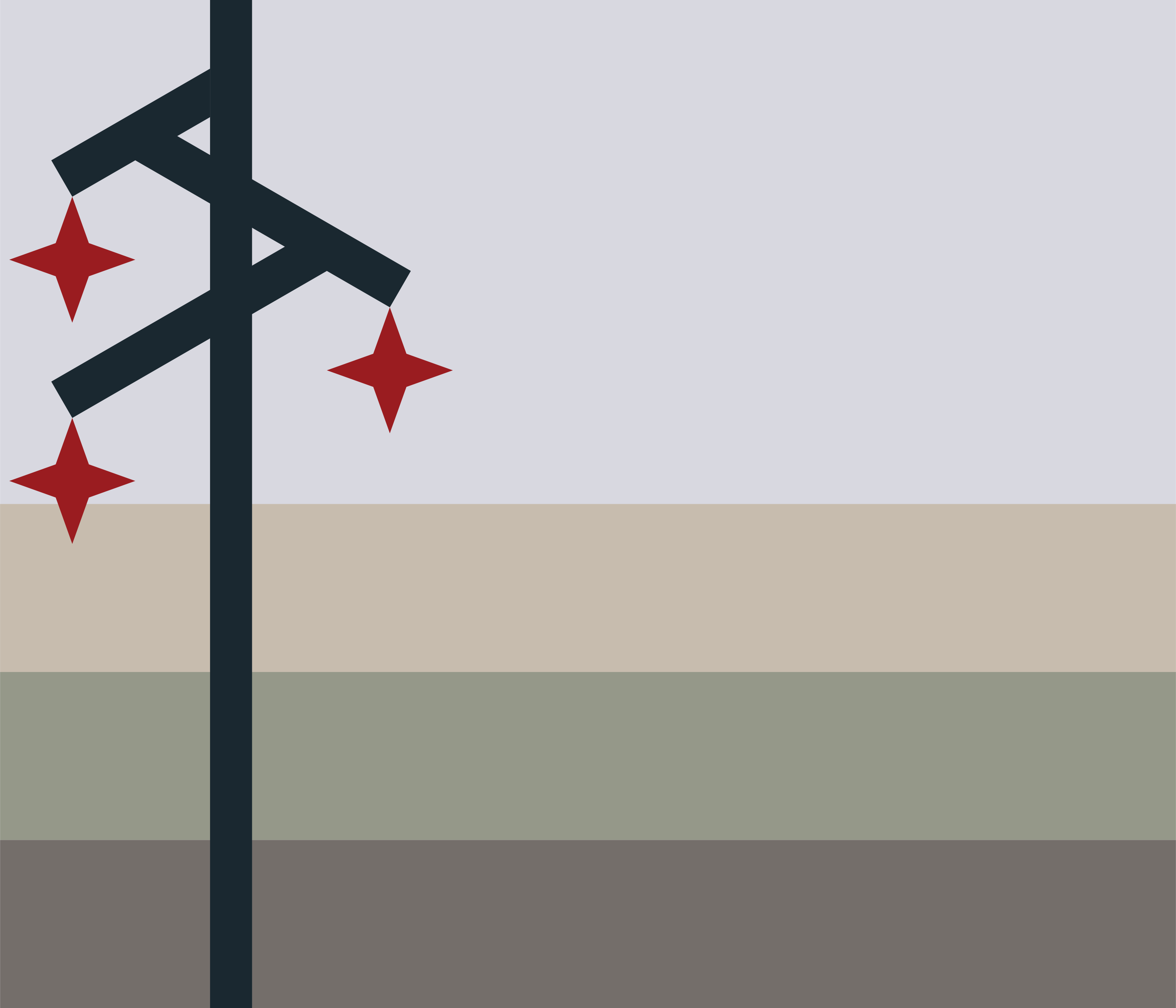
while looking at the finalist designs for the illinois flag vote and how people described the state's landscape, we got the idea to make something based on our own perspective of the state. despite the base of it being specific scenery from illinois, we aren't sure if we'd say it ended up being a flag of illinois specifically? at least not as much as it ended up being a flag representing a place that exists all over the midwest.
- brown for gravel and old pavement and rust and rotted wood. the old structures and traces of past settlement.
- green for grass and moss. weed-choked lawns and plantlife reclaiming structures and objects.
- tan for fields and field dust. the wide swathes of the land that have been ploughed over for use, emitting clouds of dust, and lying abandoned and void of life after harvest.
- grey for the clouded sky, featureless and dimly lit. the silhouette of a utility pole is the only thing jutting into it in the expanse of the country, three sparks dripping from it.
- blood red for the presence of humanity, tethered together and supported in its isolation by aging infrastructure. only existing because of bloodshed. living and dying by connections to the rest of the world.
all together it's supposed to feel like an old photo from a highway between towns. utility poles (especially in the specific criss-cross shape around where we lived) feel like a very distinct and common structure, but also more generally represent infrastructure as a whole and its importance to the development, and eventual decay, of a lot of towns across the midwest, as well as connection (both implicitly representing the value placed on tight-knit community connection in many places, and more literally the long-distance communication that provides community for those who don't have a sense of belonging in these places).
Forgottonia Flag (2024)
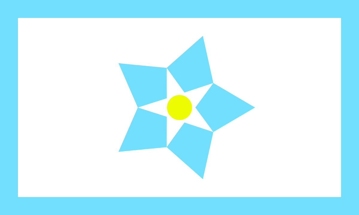
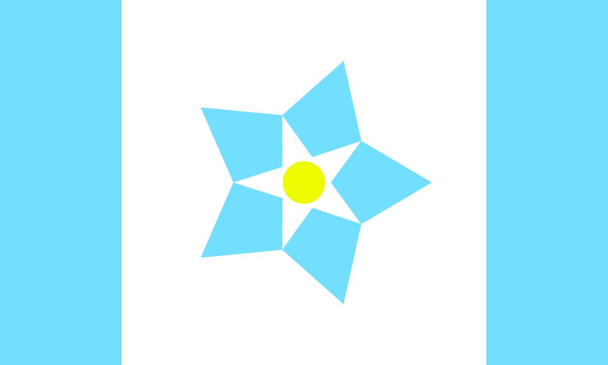
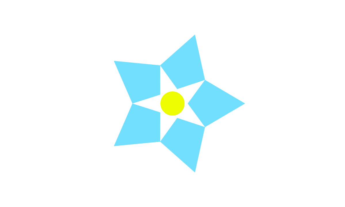
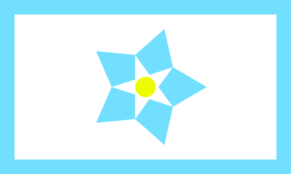
this was specifically made bcuz we have a weird kinda interest in the Forgottonia "movement", originally being from the region and all, and we figured that it'd be nice to make a (new) flag for it. the symbolism to it is:
- the base of the flag is still white to call back to the original all-white flag of surrender the "state" originally used in the 70s.
- the two overlaid star shapes and circle form a forget-me-not, mostly chosen for feeling like a fitting flower to represent the place,2 rotated to point towards the fly to represent progress.
- the blue border around the edge of the flag represents the rivers that surround and cross the region and form a major basis for its identity.
there were a couple other thoughts we had regarding potential designs for the flag, either replacing the border with two wider stripes (specifically representing the Mississippi and Illinois rivers), or removing them entirely to look more like the white flag defaced with the forget-me-not, but our favorite design of the three is the bordered one.
Pluto Flag (2023)

we made this after seeing some designs for planet flags and feeling like there wasn't one that really fully represented pluto. the little bit of symbolism here is:
- the heart represents Tombaugh Regio, and is tilted 17.16 degrees to represent Pluto's orbital inclination.
- the heart being near the fly is to represent its historical view as the furthest planet from the sun
- the reddish-brown stripe along the hoist of the flag is 2/10 the width of the flag, representing Pluto and Charon's shared status as the tenth planet from the sun1
- there isn't really any meaning to it but the ratio of the flag is 17:12, bcuz we thought itd be cool :3
IRIS flag edits
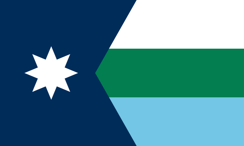
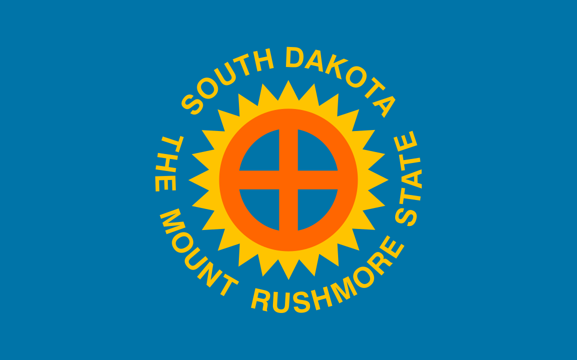
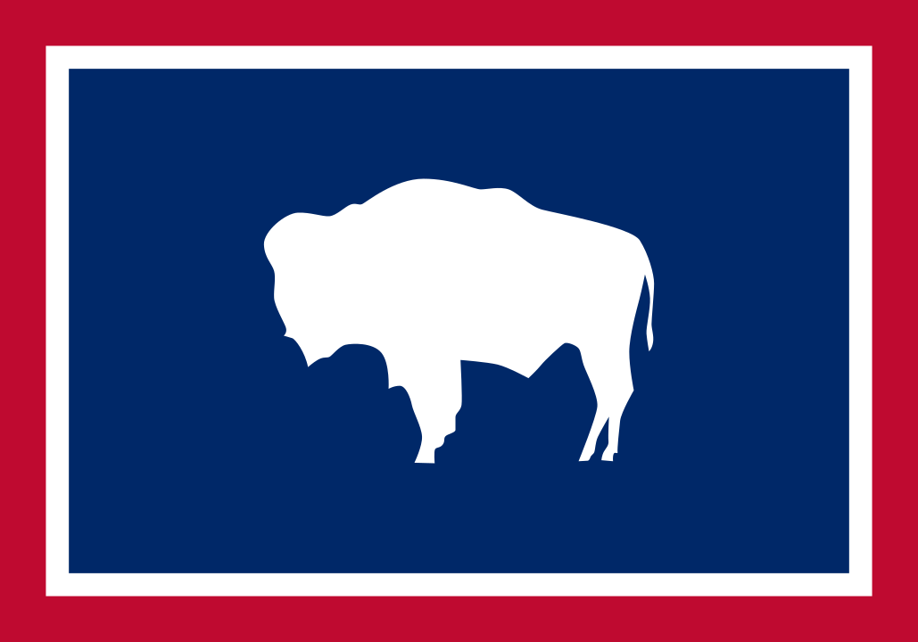
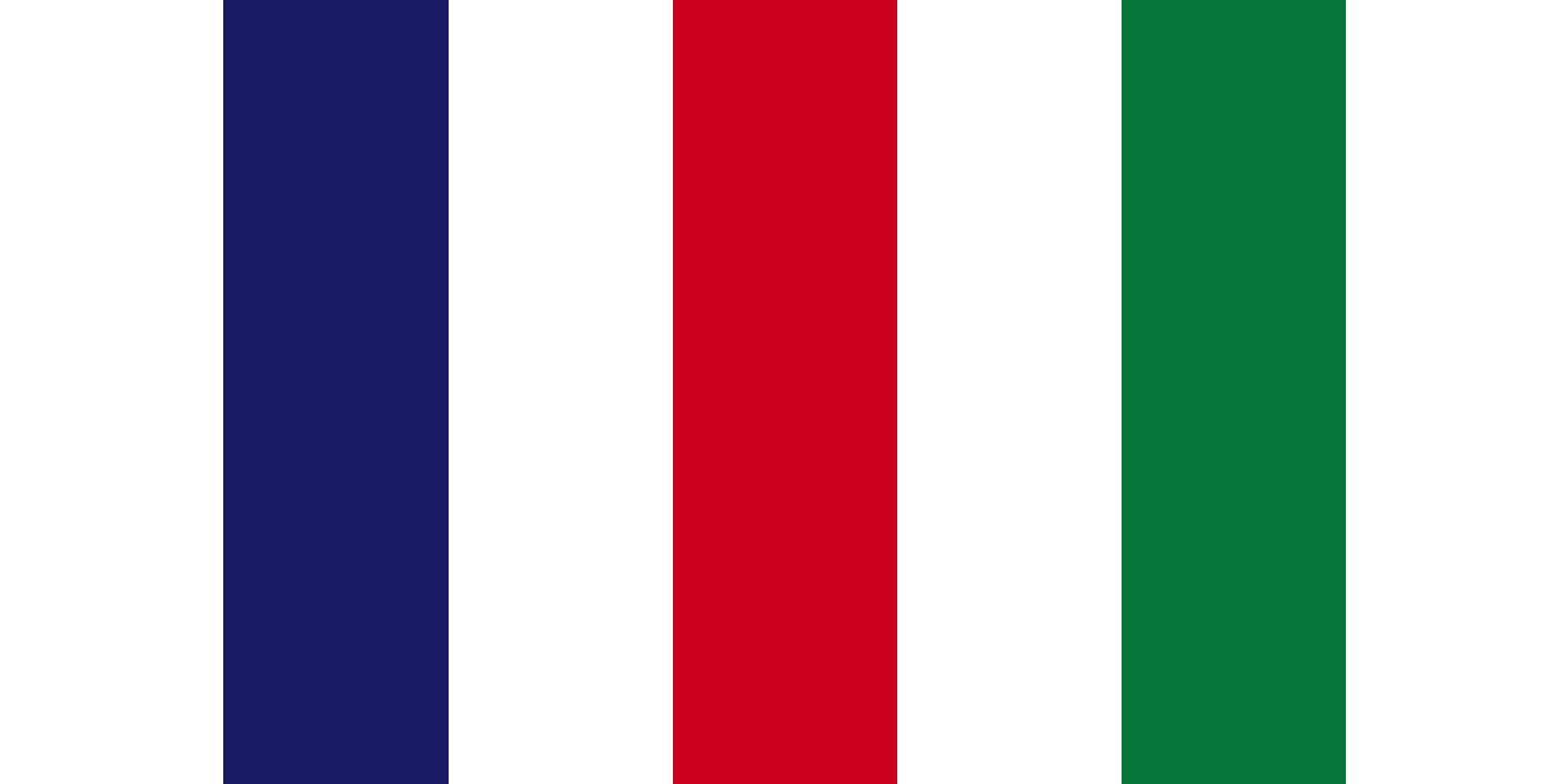
these were various flags we've put together initially for use in IRIS, but didn't end up actually using anywhere. most of these are just edits of actual flags, so we don't really feel right claiming them as wholly ours, but we figured we might as well share them anyways.