these are the different styles you can view the site with! we've always thought style switchers are a cool feature on sites we've seen them on, so while we were doing the big update we figured we'd implement smth ourselves. below are brief descriptions of each of the available styles so far:
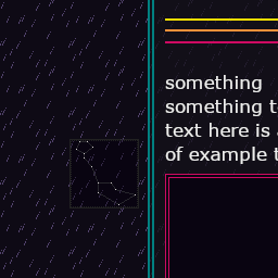
default dark (dark.css)

the default theme, based on the site's styling from before the redesign. we have a preference towards dark themes because it's easier for us to look at when we have a migraine, so when we were originally making the site we leaned towards something darker and eventually settled on this general color palette. the combination of rain and stars just felt right for the site's whole vibe. the constellations in the background are Anguilla the Eel, Apis the Bee (or Musca the Fly), Uranoscopus the Stargazer Fish, and Cetus the Whale!
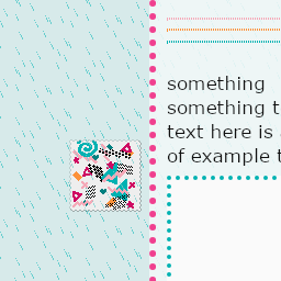
light rain (light.css)

the main light theme, kinda styled around being an inversion of the dark theme. it felt important to at least have one normal light theme for people who have an easier time using something like that over a dark mode, but we didnt wanna just flip the colors and call it a day, so we tried to differentiate it a bit. the shape things in the background were made from little pixel stamps we made based on the results screen from Kirby's Dream Course!
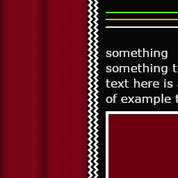
inside a dream (peaks.css)

this style is based around the show Twin Peaks, which we happen to enjoy a lot! the main colors are based around the red curtains and black and white floor of the red room, with the site logo and some of the accenting taken from the logo for the series. it also ended up reminding us of Vimm's Lair a little bit in the end, although it's a lot more angular.
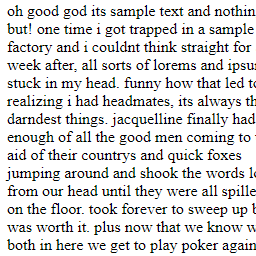
no style (plain.css)

the idea for this style came to us when we kept demoing the style switcher and seeing what the pages looked like without a stylesheet applied. we thought it'd be funny to have a theme that was basically just that, but with some styling to it to make some of the rough edges more presentable. we also figured that we could try to not use css variables like wed switched to, just to kinda complete the weird unformatted early internet vibe it had going on.


